 Wajdi Alkayal

Mobile screens are not as wide as desktop and laptop screens. When building websites, it’s often necessary to devise a means to display the site’s menus and navigation to mobile users.
There are various ways to display menu items on a mobile screen. One of the most popular techniques is to hide the menu from the screen and bring it to view when needed or prompted. In many cases, this is when the menu icon is clicked.
In this tutorial, we show you how to create mobile menus that slowly come into view and have an animated feel to them. We’ll use HTML and CSS only.
Building an animated, slide-in side menu
To get started,we need to create a folder for our project, then we create index.html and styles.css files in our project folder.
In the HTML file, let’s add the starter boilerplate. If you’re using VSCode, you can press ! and enter on your keyboard to get the starter boilerplate. Don’t forget to import your styles.css file in your HTML file.
Below is the starter boilerplate that we will be working with:
<!DOCTYPE html>
<html lang="en">
<head>
<meta charset="UTF-8">
<meta http-equiv="X-UA-Compatible" *content*="IE=edge">
<meta name="viewport" content="width=device-width, initial-scale=1.0">
<title>Document</title>
<link rel="stylesheet" *href*="styles.css">
</head>
<body>
</body>
</html>
Creating the mobile screen content
Next, we’ll create the mobile screen and some page content. Add the following lines of code and we’ll go through them together:
<div class="screen1_container">
<!-- The nav bar with logo and menu items-->
<nav class="screen1_menu_container">
<h4>Logo</h4>
<label for="screen1_menu_check" class="screen1_menu_btn">
<!-- checkbox to track when the hamburger menu is clicked on -->
<input
type="checkbox"
id="screen1_menu_check"
/>
<!-- the hamburger menu -->
<div class="screen1_menu_hamburger"></div>
<!-- menu items -->
<ul class="screen1_menu_items">
<li>Home</li>
<li>About</li>
<li>Contact</li>
</ul>
</label>
</nav>
<!-- The page body content -->
<div class="page_content">
<h3>This is the first screen</h3>
<p>We are creating animated mobile menus</p>
</div>
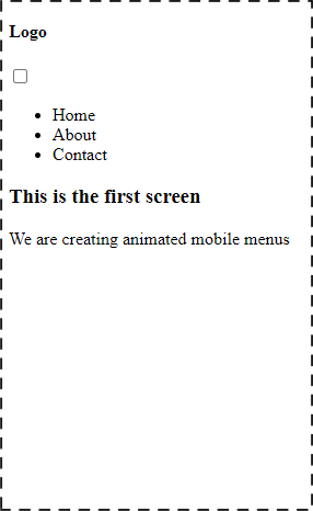
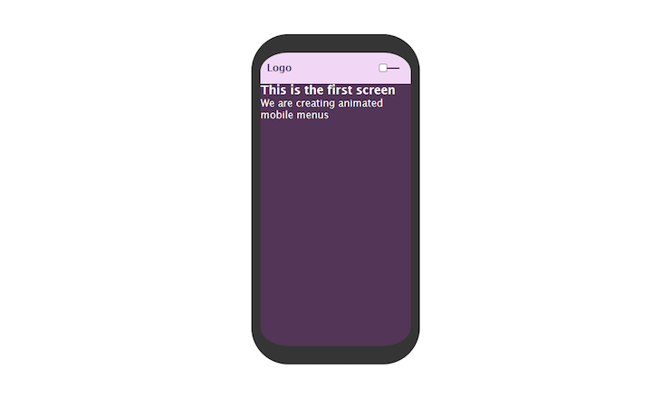
</div>The outermost div represents the mobile phone’s body as well as the wrapper for the menu bar and page content. It has two elements in it: the nav and another div, which contains the page’s content.
Like many other menu bars, ours will have a logo and hamburger menu aligned to the sides of the nav element.
In the nav element, we have a checkbox that will be used to track whether the hamburger has been clicked, the hamburger div, and the nav items.
Let’s see what they look like now:
Now let’s start styling our mobile screen.
Styling the mobile screen
* {
margin: 0;
padding: 0;
box-sizing: border-box;
}

body{
display: flex;
justify-content: center;
align-items: center;
column-gap: 40px;
min-height: 100vh;
font-family: 'Lucida Sans', 'Lucida Sans Regular', 'Lucida Grande', 'Lucida Sans Unicode', Geneva, Verdana, sans-serif;
}
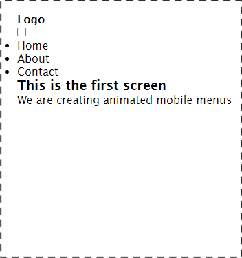
This is the general styling for the page. Now the page should look like this:
Now let’s style the mobile container. Add the following lines of code in your CSS file:
.screen1_container{
width: 17em;
height: 80vh;
background-color: #533557;
position: relative;
overflow: hidden;
border: 15px solid rgb(54, 53, 53);
border-top: 30px solid rgb(54, 53, 53);
border-bottom: 30px solid rgb(54, 53, 53);
border-radius: 60px;
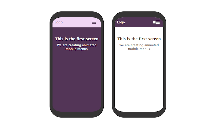
}This is the mobile container for the first screen. We gave it a width and height, as well as a background color. We also gave it a relative positioning and added borders and a border radius to the container.
It should look like this now:
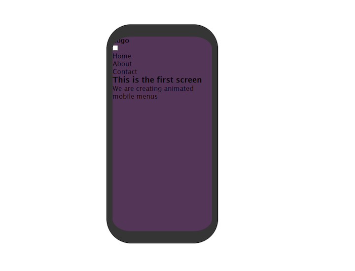
In our body styles, let’s add color:white. This will give a better contrast to the page and we can easily see what we are working on.
Styling the nav bar
To style the navbar we will add the following lines of code to our styles.css:
.screen1_menu_container{
display: flex;
align-items: center;
justify-content: space-between;
background-color: #f1d6f5;
color: #533557;
padding: 0 10px;
}
.screen1_menu_btn{
display: flex;
justify-content: center;
align-items: center;
width: 50px;
height: 50px;
cursor: pointer;
transition: all .5s ease-in-out;
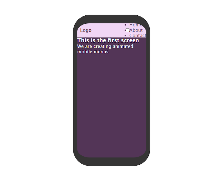
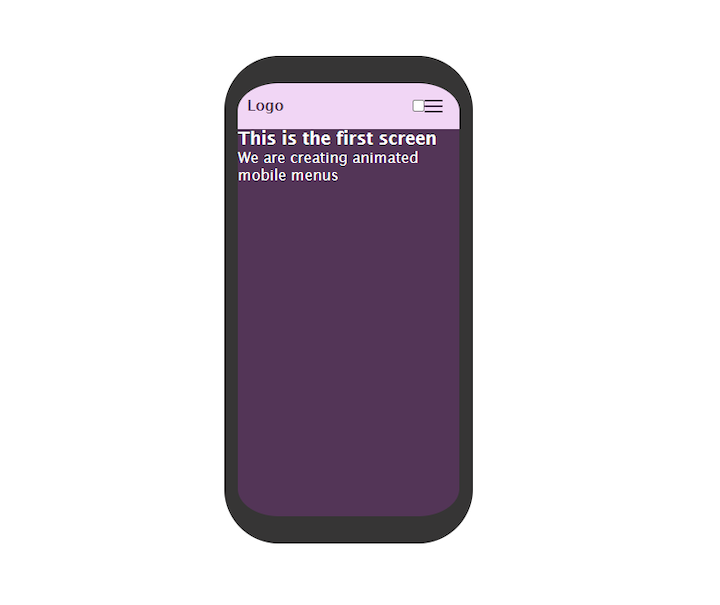
}We added display:flex to the nav bar (.screen1menucontainer) to make the items in it have a horizontal layout.
Here’s what it should look like now:
Let’s hide the ul for now so we can style the hamburger without being interrupted.
ul{display: none;}Creating the hamburger
For our hamburger style, let’s start by adding the following lines to styles.css:
.screen1_menu_hamburger{
        width: 20px;
        height: 2px;
        background-color: #533557;
        border-radius: 5px;
        z-index: 10;
        transition: all .5s ease;
}
Now we should see something like this on the screen:
It shows a single bar. Let’s write some code to make it look like the hamburger we all know and love.
.screen1_menu_hamburger::before,
.screen1_menu_hamburger::after{
        content: '';
        position: absolute;
        width: 20px;
        height: 2px;
        background: #533557;
        border-radius: 5px;
        transition: all .5s ease;
}

.screen1_menu_hamburger::before{
    transform: translateY(-6px);
}

.screen1_menu_hamburger::after{
    transform: translateY(6px);
}
We used the before and after pseudo-elements to add the top and bottom hamburger bar.
For the top bar, we used translateY to push it above the hamburger. For the bottom bar, we pushed it below the hamburger.
If you check the progress now, you’ll see the typical hamburger that we are all accustomed to seeing on websites:
Styling the menu items
To style the menu items on our mobile screen, we will add the following styles to our file.
.screen1_menu_items{
        background:  #f1d6f5;
        color: #533557;
        position: absolute;
        height: 100%;
        width: 70%;
        padding-top: 70px;
        top: 0;
        transition: all .5s ease-in-out;
}
Giving the menu items a height of 100% means that it will occupy the full length of the screen. We also gave it an absolute position and made sure there is no space between the menu and the top part of the screen by using top:0.
While we’re at it, let’s also style the list items
Styling the list items in the menu
To make the list items look presentable, we’ll add the following lines in our styles.css file:
.screen1_menu_items li{
        padding: 10px 0;
        text-align: center;
        list-style-type: none;
        transition: all .2s ease;
}

.screen1_menu_items li:hover{
        letter-spacing: 2px;
        opacity: .6;
}
We added top and bottom padding for the list items and aligned them in the center of their container. We also added a hover effect for the list items in the menu by increasing the letter spacing whenever they are hovered over.
Let’s animate the hamburger now.
Animating the hamburger
We’ll start with the middle one. The general idea is to have it go out of view when clicked on, so that the top and bottom bars form an exit or close sign.
How do we do this?
We can track when the hamburger is clicked using the checkbox input. When checked, we add the styles we want; if the checkbox is not checked, the styles do not take effect.
Let’s add the following to our styles.css file:
.screen1_menu_btn input:checked ~.screen1_menu_hamburger{
        transform: translateX(-50px);
        background: transparent;
    }
When you click on the hamburger menu, you’ll notice it goes out of view. We did this by moving the menu to the left and making it transparent. Progress!
Let’s add the styles for the top and bottom bars:
.screen1_menu_btn input:checked ~.screen1_menu_hamburger::before{
    transform: rotate(45deg) translate(35px, -35px);
}

.screen1_menu_btn input:checked ~.screen1_menu_hamburger::after{
    transform: rotate(-45deg) translate(35px);
}
If you check the project, you’ll notice the top and bottom bars form an “X” when the hamburger is clicked. This is achieved by rotating the top bar 45 degrees and bottom -45 degrees, and the translate values are to prevent them from moving to the left with the middle hamburger bar.
Let’s add some final touches to our work.
Animating the menu items
Add the following line to .screen1_menu_items:
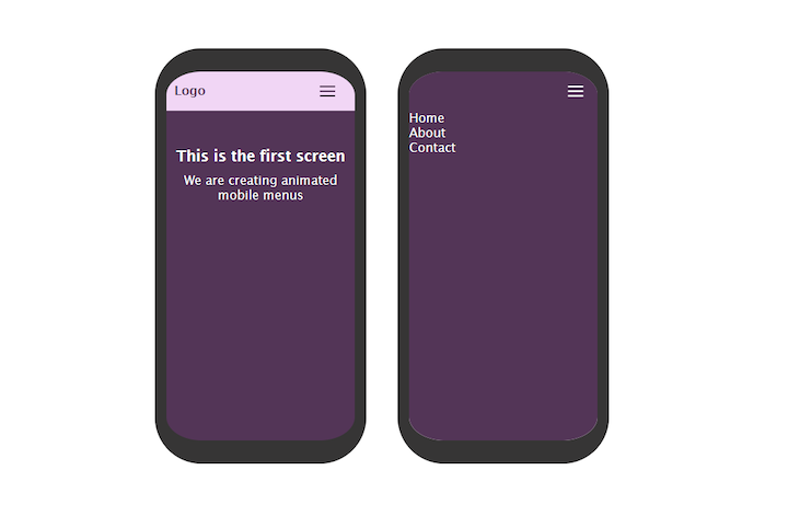
left: 100*%*;This pushes the menu items out of the screen when the hamburger is not checked.
It should look like this now:
.screen1_menu_items{
        background:  #f1d6f5;
        color: #533557;
        position: absolute;
        left: 100%;
        height: 100%;
        width: 70%;
        padding-top: 70px;
        top: 0;
        transition: all .5s ease-in-out;
}
Next, add the following line to bring it back to the screen when the hamburger is checked:
.screen1_menu_btn input:checked ~.screen1_menu_items{
    left: 40%;
}
Final steps
We’re almost done! Now let’s hide the checkbox input and make the page body look more presentable:
.screen1_menu_btn input{
display: none;
}
.page_content{
text-align: center;
margin-top: 3em;
}
.page_content h3{
padding-bottom: 10px;
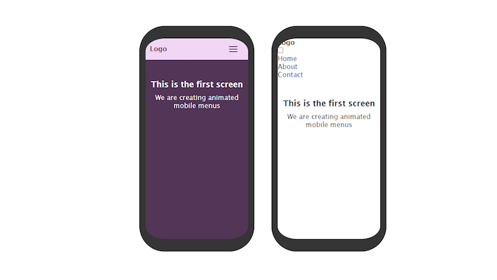
}That’s it! We’ve successfully created a mobile animated menu that slides in and out. We also gave the hamburgers an animated effect when clicked on.
Our screen should look like this now:
Building an animated, slide-down menu
For this example, the screen will look like the first screen, but the difference will be the menu items. The menu won’t slide in from the side; rather, it will slide down from the top.
Creating the mobile screen content
In our HTML file, add the following lines of code:
<!-- screen two -->

<div class="screen2_container">
    <nav class="screen2_menu_container">
        <h4>Logo</h4>

        <label for="screen2-menu_check" class="screen2_menu_btn">
            <input type="checkbox" id="screen2-menu_check"/>

            <div class="screen2_menu_hamburger"></div>

            <ul class="screen2_menu_items">
            <li>Home</li>
            <li>About</li>
            <li>Contact</li>
            </ul>
        </label>
    </nav>

    <div class="page_content">
        <h3>This is the second screen</h3>
        <p>We are creating animated mobile menus</p>
    </div>
</div>
It looks just like the first one because it has the same required markup.
That’s all we need for the HTML. Now let’s style our slide-down menu.
If you check out the project on your local server, you’ll notice only the checkbox shows. That’s because we made the page colour white when we were working on the first screen.
Let’s add some styling to the second screen container.
Styling the mobile screen
Add the following lines to your styles.css file:
.screen2_container{
    width: 17em;
    height: 80vh;
    position: relative;
    overflow: hidden;
    color: rgb(54, 53, 53);
    border: 15px solid rgb(54, 53, 53);
    border-top: 30px solid rgb(54, 53, 53);
    border-bottom: 30px solid rgb(54, 53, 53);
    border-radius: 60px;
}
The styles above create our screen container and and enable us to make the content visible by adding a dark color style to it.
The content on the page looks presentable because of the page styles we used in the first screen. It should look like this now:
Styling the nav bar
To style the nav bar, we will add the following styles to our styles.css file:
.screen2_menu_container{
display: flex;
align-items: center;
justify-content: space-between;
padding: 0 10px;
background-color: #533557;
color: white;
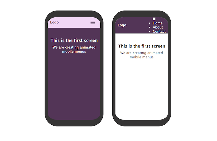
}The styles change the background color of the nav bar as well as the layout of the nav to a horizontal one. Justify-content: space-between causes the items inside the nav bar to stay at opposite ends of their container and leave a space between them.
The nav bar should look like this now:
Let’s hide our ul so we can style our hamburger menu first. We’ll do it with the following line of code:
ul{display: none;}Now add this line to style the hamburger menu wrap:
.screen2_menu_btn{
    display: flex;
    justify-content: center;
    align-items: center;
    width: 50px;
    height: 50px;
    cursor: pointer;
    transition: all .5s ease-in-out;
}
We gave it a display of flex, added a height and width, and made the cursor pointer.
Styling the hamburger
We cannot see the hamburger bars yet. Let’s make them visible by adding the following lines to our styles.css:
.screen2_menu_hamburger{
    width: 20px;
    height: 2px;
    background-color: white;
    border-radius: 5px;
    z-index: 10;
    transition: all .5s ease;
}

.screen2_menu_hamburger::before,
.screen2_menu_hamburger::after{
    content: '';
    position: absolute;
    width: 20px;
    height: 2px;
    background: white;
    border-radius: 5px;
    transition: all .5s ease;
}

.screen2_menu_hamburger::before{
    transform: translateY(-6px);
}

.screen2_menu_hamburger::after{
    transform: translateY(6px);
}
Just as we did when creating the first screen, we have a markup for the middle bar and used the before and after pseudo-elements to add the top and bottom bars. We also raised the top bar and pushed the bottom bar below the hamburger menu’s middle bar.
It should look like this now:
Animating the hamburger
To animate the hamburger when clicked, we’ll add the following styles:
.screen2_menu_btn input:checked ~.screen2_menu_hamburger::before{
    transform: rotate(45deg) translate(35px, -35px);
}

.screen2_menu_btn input:checked ~.screen2_menu_hamburger::after{
    transform: rotate(-45deg) translate(35px, 35px);
}

.screen2_menu_btn input:checked ~.screen2_menu_hamburger{
    transform: translateX(-50px);
    background: transparent;
}
Just like in the first screen, we moved the middle bar out of view and caused the top and bottom bars to form an “X” sign when clicked. They revert to their former positions when the checkbox is unchecked.
You can try checking it out in your live server to preview the effects when the menu is clicked.
Styling the menu items
We need to remove the styles that we used earlier to hide the ul element, and add the following to the stylesheet:
.screen2_menu_items{
    position: absolute;
    top: 0;
    background:  #533557;
    height: 100%;
    width: 100%;
    left: 0;
    transition: all .5s ease-out;
    padding-top: 50px;
}
The menu item is positioned absolutely to its container, and made full-width. We also gave it a height of 100%. We added a top padding to create some space between the menu and the screen. We gave it a top value of 0 to make it stick to the top for the purpose of styling. We’ll change that soon.
Now our menu looks like this:
Let’s style the items in the menu with the following lines:
.screen2_menu_items li{
    border-bottom: .5px solid rgb(182, 181, 181);
    padding: 24px 0;
    text-align: center;
    transition: all .2s ease-out;
    }
Next, add a hover effect to the list items with the following lines:
.screen2_menu_items li:hover{
    letter-spacing: 2px;
    opacity: .6;
}
Animating the menu items
Now let’s push the menu items out of view so we can see the animated effect when the hamburger menu is clicked. We do this by giving the screen menu items a top value of -500px.
The menu should now look like this:
.screen2_menu_items{
    position: absolute;
    top: -500px;
    background:  #533557;
    height: 100%;
    width: 100%;
    left: 0;
    transition: all .5s ease-out;
    padding-top: 50px;
}
Now our menu items are hidden from view. We’ll make it slide down when the hamburger is clicked and back up when we click the close sign.
Add the following lines to your styles.css:
.screen2_menu_btn input:checked ~.screen2_menu_items{
    top:0;
}
Remember, we pushed the menu out of view. Now, with the line of code we just added, whenever the checkbox is checked, the menu slides down. When unchecked, it slides back up.
Final steps
We’re almost done with our second screen. Let’s give it a final touch by hiding the checkbox with the following lines of code:
.screen2_menu_btn input{
display: none;
}
That’s it! We’re done with our second screen. When clicked, it slides down. When the close icon is clicked, it goes out of view.
Our finished menus should now look like this:
Check out a demo of our completed example menus.
Conclusion
If you’ve reached this point, you should have all the foundational knowledge you need to create two types of animated menus with HTML and CSS only — no JavaScript required.
With the new skills you’ve acquired, you can create different kinds of CSS mobile menus and make them as beautiful as you want. To start practicing, you can modify the ones we built together and create your own magic.


