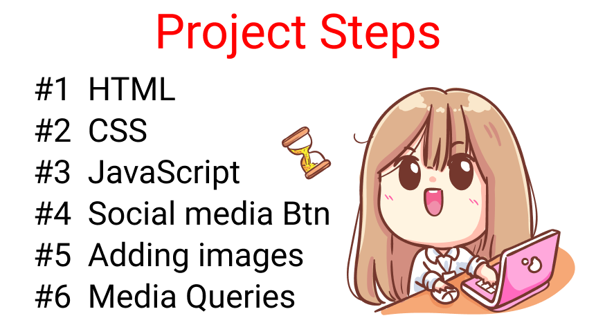
Today we're going to learn how to do form validation in JavaScript. We'l also add images and media queries to build out the entire project and keep it as a portfolio.
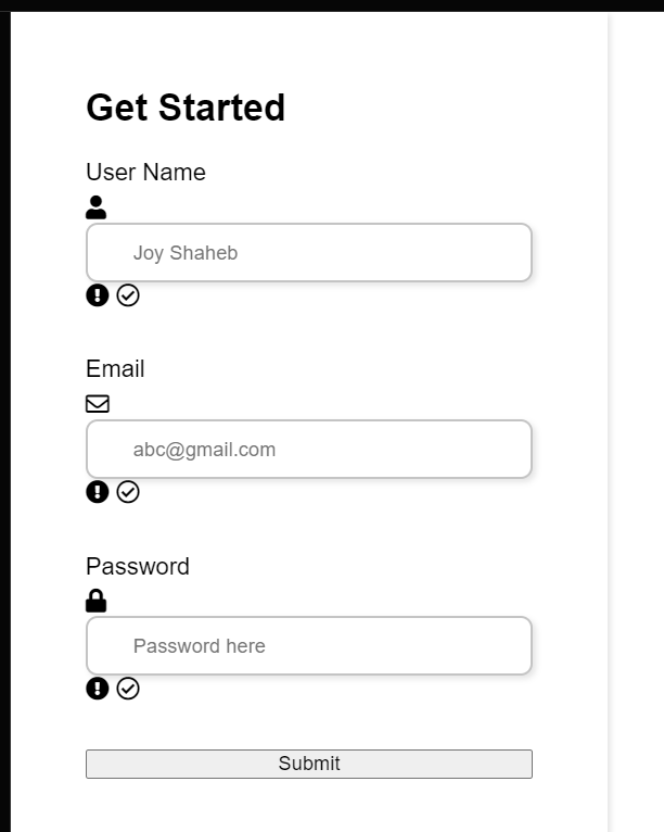
Here's the project demo that we're gonna build 👇
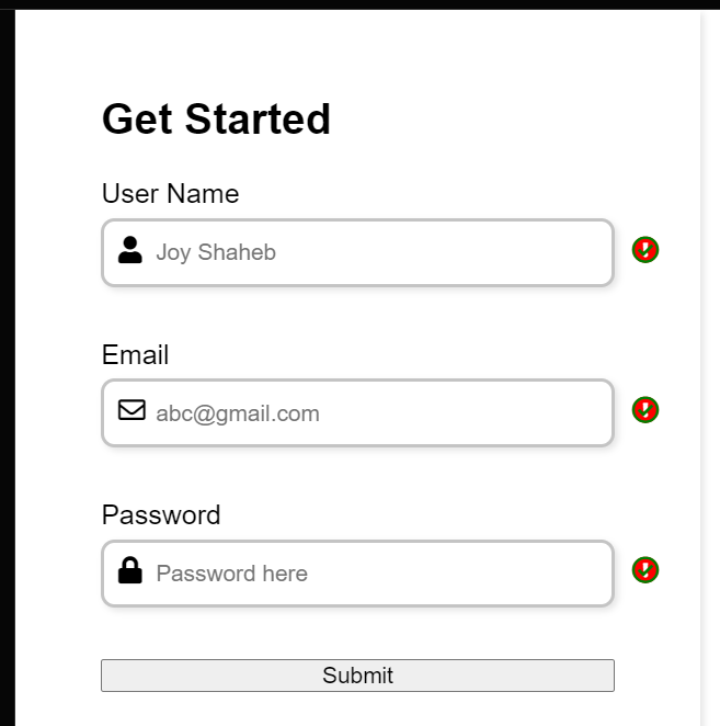
Desktop design
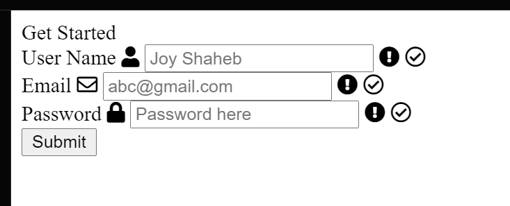
Here's a small sample of how the form will work 👇
project sample
You can watch this tutorial on YouTube as well if you like:
Source code
You can get the source code, including the images, from here:
Look, the success and failure icons are overlapping each other. Don't worry, we will manipulate those in JavaScript. For now, you can hide them like this👇👇
Now, we will create a function named engine which will do all sorts of form validation work for us. It will have three arguments – follow along here: 👇
letengine=(id, serial, message)=>{}
The arguments represent the following:
id will target our id
serial will target our classes [error class, success and failure icons]
message will print a message inside our .error class
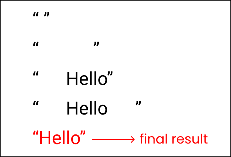
Note: the id.value.trim()will remove all the extra white spaces from the value which the user inputs. You can get an idea of how it works by looking at this illustration 👇
trim() used to remove extra spaces
Now, look at our objectives 👇
We want the JavaScript to print a message inside the error class whenever the user submits a blankform. At the same time, we want the failure icons to highlight as well.
But, if the user fills in all the inputs and submits it, we want the success icon to be visible.
To accomplish this, write this logic 👇 to print the message:
Time to implement our newly created function. Write these inside the place where we added the submit event listener 👇
form.addEventListener("submit",(e)=>{
e.preventDefault();engine(username,0,"Username cannot be blank");engine(email,1,"Email cannot be blank");engine(password,2,"Password cannot be blank");});
Here, we are passing the id names, serials of our class names, and passing the message which should be printed when we find an error when the user submits the form.
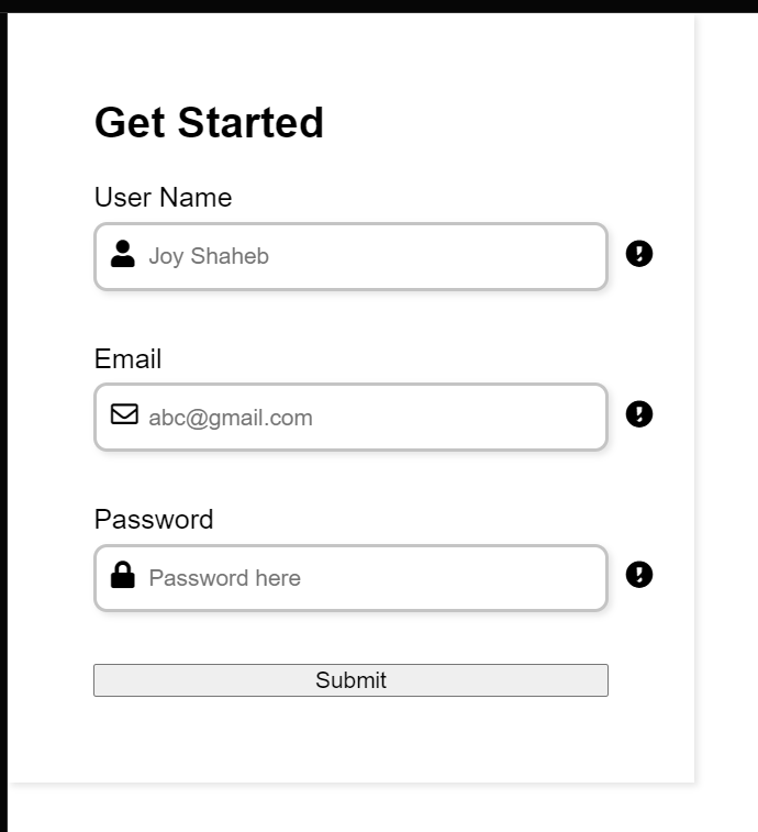
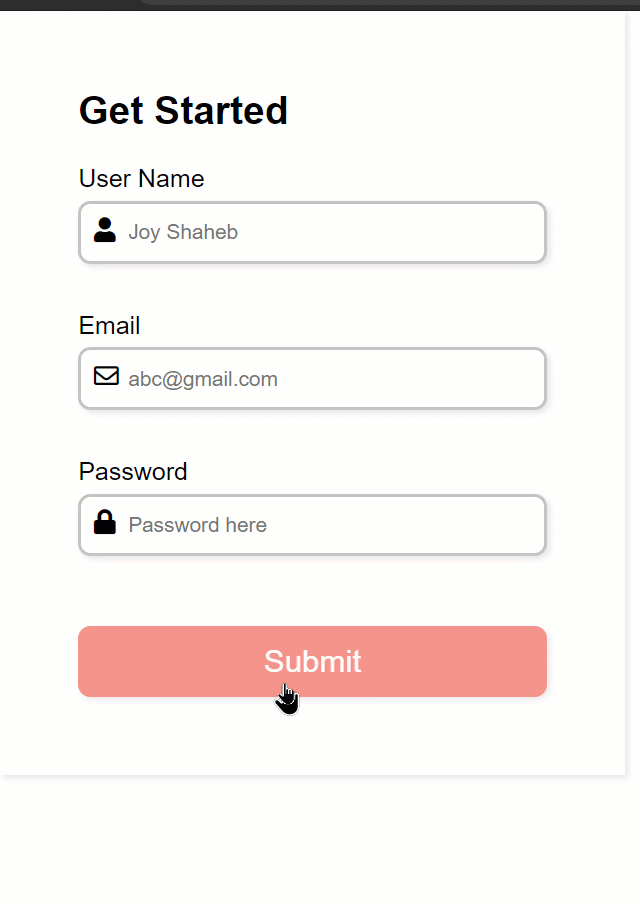
Here are the results so far 👇
The Result so far
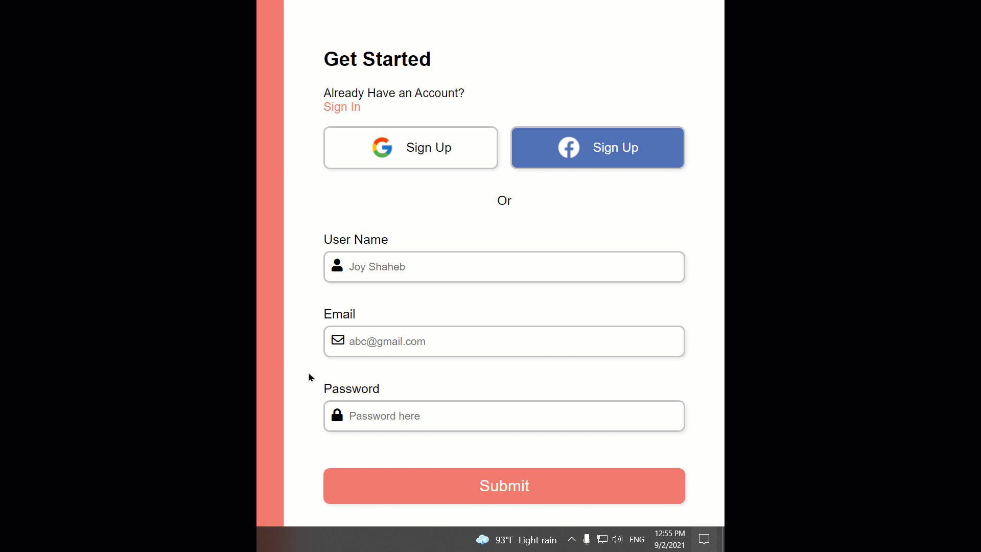
How to Add the Social Media Buttons
So far so good, let's add social media sign up options. Follow along here. 👇
Inside the form tag, create a new div with the class name social:
<formid="form"><divclass="social"><divclass="title">Get Started</div><divclass="question">
Already Have an Account? <br/><span>Sign In</span></div><divclass="btn"></div><divclass="or">Or</div></div><!-- other codes are here--></form>
Inside the .btn class, we create two more divs with class names .btn-1 and .btn-2 with the images and text as well
<divclass="btn"><divclass="btn-1"><imgsrc="https://img.icons8.com/color/30/000000/google-logo.png"/>
Sign Up
</div><divclass="btn-2"><imgsrc="https://img.icons8.com/ios-filled/30/ffffff/facebook-new.png"/>
Sign Up
</div></div>
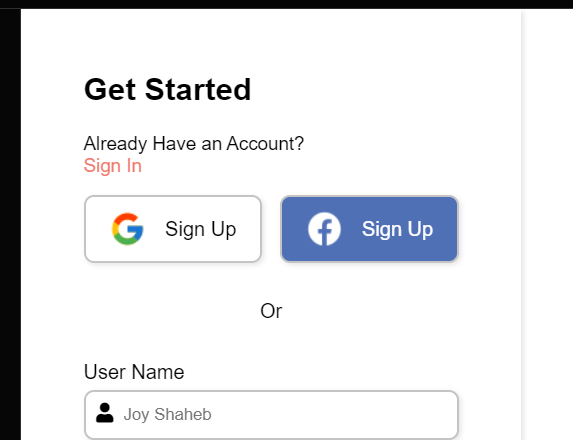
Here are the results so far 👇👇
The Result so far
Now, let's style the .btn-1 and .btn-2 first. We'll change the alignment of the buttons to row from column 👇
/**
* ! style rules for social section
**/.btn{display: flex;flex-direction: row;justify-content: space-between;gap: 15px;}
Now, let's add images to our project. First, let's write the HTML 👇
<divclass="container"><divclass="content"><divclass="logo"><imgsrc="https://svgshare.com/i/_go.svg"alt=""/></div><divclass="image"></div><divclass="text">
Start for free & get <br/>
attractive offers today !
</div></div><formid="form"><!--other codes are here --></form></div>
The result so far 👇
Result so far
Now we need to change the orientation of our content from column to row. Follow along 👇
For screens with a width from 425px, we will make these minor changes 👇
@media(max-width: 425px){form{padding: 20px;}}
Here's the final result 👇👇
The final result
Conclusion
Congratulations !
Congratulations for reading until the end. Now you can easily and efficiently use JavaScript to handle form validation. Not only that, you also have a project to show your local recruiter!
Here's your medal for reading till the end ❤️
Suggestions & Criticisms Are Highly Appreciated ❤️
 Wajdi Alkayal