
 Wajdi Alkayal

Building data stories through charts with Vizzu

Introduction
Data is important, and its importance cuts across all spheres of our lives. Data is so important that individuals, businesses, and organizations invest their resources in data collection operations. However, how data is displayed is just as important as gathering it. It is important to display data in a meaningful way that the target audience can easily consume and understand. Most of the time, people present data in the form of a chart.
Several open source libraries solve the issues of the visual representation of data, and Vizzu is one of them. Vizzu is a free, open source JavaScript library for building animated charts, data stories, and interactive explorers. Unlike other chart libraries, Vizzu doesn’t just enable us to display data, but animates it as well.
In this article, we will learn how to build and animate charts with Vizzu. We will dive into how Vizzu works, its features, and the different animations it supports.
Installation
Run the command below in your terminal to install Vizzu:
npm install vizzuAlternatively, we can install Vizzu through its CDN:
<script type="module">
import Vizzu from 'https://cdn.jsdelivr.net/npm/vizzu@latest/dist/vizzu.min.js';
</script>
Creating a simple bar chart
The core of any chart is the data that we will plot on the chart.
There are two types of chart data in Vizzu, “dimensions” and “measures”. The dimensions are the categories of each element on the chart, and the measures are the values of those elements. Dimensions accept only an array of strings, and measures accept only numbers.
Let’s see how dimensions and measures work in code by creating some data for a bar chart:
const barData = {
  series: [
    { name: "Names", values: ["Alice", "Bob", "Ted", "John", "Rose"] },
    { name: "Ages", type: "measure", values: [15, 32, 12, 36, 28] },
  ],
};
In the barData array, the Names data is the dimensions, and Ages is the values. We explicitly set the type for Ages but not for Names. This is because the type property is optional.
If the type property is omitted, Vizzu will automatically select the type depending on the first element of the values array using the typeof operator. If all items are numbers, it will be declared as a measure. In any other case, it will be declared as a dimension.
Having defined the data, let’s set up the HTML where we will display the chart:
<!DOCTYPE html>
<html lang="en">
  <head>
    <title>LogRocket Vizzu Article</title>
  </head>
  <body>
    <div class="chart" id="vizzu-bar"></div>

    <script type="module" src="/script.js"></script>
  </body>
</html>
We set up a div and give it a class of “chart”. We’ll target this class and use it to style the div.
Then, we give the div an ID of “vizzu-bar” and link to a script.js file where we will initialize the chart functionality. We will target this div in our JavaScript file later on.
Next, we style the div element:
.chart {
  width: 600px;
  height: 450px;
  border: 1px solid black;
}
Here, we set the width, height, and border of the div.
Next, we initialize the chart in the script.js file:
import Vizzu from "https://cdn.jsdelivr.net/npm/vizzu@latest/dist/vizzu.min.js";
const barData = {
series: [
{ name: "Names", values: ["Alice", "Bob", "Ted", "John", "Rose"] },
{ name: "Ages", type: "measure", values: [15, 32, 12, 36, 28] },
],
};
//new instance of the 'Vizzu' class
let barChart = new Vizzu("vizzu-bar", { data: barData });
//we initialize the bar chart with the `animate` call
barChart.animate({
config: {
channels: {
x: { set: ["Names"] },
y: { set: ["Ages"] },
},
},
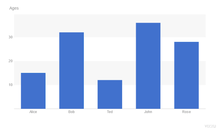
});Let’s break down the code snippet above. First, we import the Vizzu class constructor. Then, we create a new object instance of the Vizzu class and pass in the "vizzu-bar” ID we set up. We also pass in the data to the instance. Finally, we initialize the chart with the animate call.
The animate method accepts an object where we define how the data is plotted on the chart. The config object has a channels property where we add the data to the relevant axes. We pass Names to the x-axis and Ages to the y-axis.
With that, we have created a simple static bar chart.
Adding animations to charts
As we learned earlier, the major function of Vizzu is not in creating charts but animating them. Before we add animations to the bar chart we created, let’s understand how Vizzu animates charts.
Every animate call holds the current state of a chart’s configuration. The first animate call renders a static chart, while subsequent calls transition the chart between the different animation states we set. Vizzu automatically transitions between these.
Every animation state holds the property of the chart we want to animate, such as the labels, titles, and geometry.
Now that we understand how Vizzu chart animations work, let’s animate the bar chart:
//first animate call display chart
barChart.animate({
  config: {
    channels: {
      x: { set: ["Names"] },
      y: { set: ["Ages"] },
    },
  },
});

//chart animation call
barChart.animate({
  geometry: "circle",
});
We have learned that to animate charts in Vizzu, we need to call the animate method twice.
In the code snippet above, the first animate call is responsible for initializing the chart. We did this earlier when we created the bar chart.
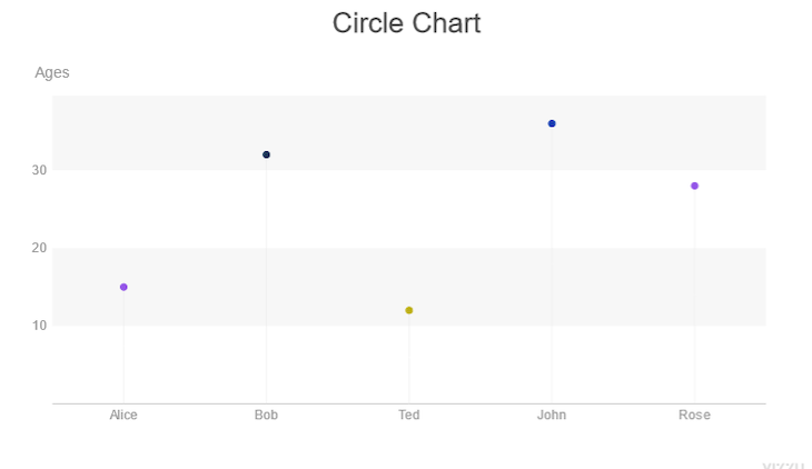
The second animate call is responsible for animating the chart. We define the properties of the chart we want to animate in the second call. Here, we animate the geometry property and change it to a circle. With this, the appearance of the plotted areas on the chart will transition from rectangular bars to circular dots.
Apart from defining the properties we want to animate, we can also control the behavior of the animation like so:
//chart animation call
barChart.animate(
  { geometry: "circle" },
  { geometry: { duration: 4, delay: 4, easing: 'linear' }}
);
Here, we set the duration and delay to four seconds and set the easing to “linear”.
Styling charts
We can see the default appearance of a Vizzu chart from the screenshot of the bar chart we created. We can customize the appearance of charts using the style object.
Colors
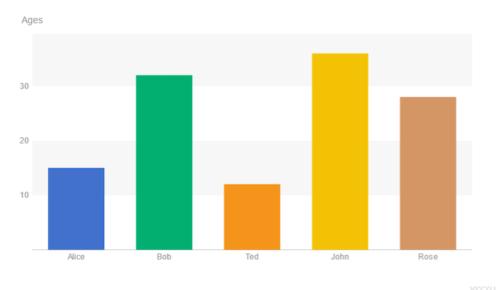
Aside from the blue color that Vizzu applied to charts, it comes with its default color palette that we can use to change the appearance of charts. However, we have to activate this feature for it to be applied.
Let’s apply Vizzu’s default colors to our bar chart:
//basic setup of our bar chart
barChart.animate({
  config: {
    channels: {
      x: { set: ["Names"] },
      y: { set: ["Ages"] },

      //Vizzu's color palette added
      color: { set: ["Names"] },
    },
  },
});
It’s that simple. With these two lines of code, we have improved the appearance of our bar chart.
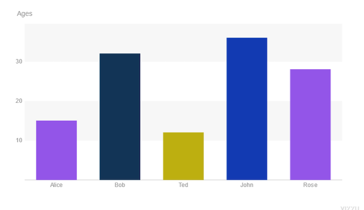
Aside from using Vizzu’s default colors, we can also define custom pallets that fit our brand’s identity or design requirements:
barChart.animate({
  config: {
    channels: {
      x: { set: ["Names"] },
      y: { set: ["Ages"] },
      color: { set: ["Names"] },
    },
  },

  style: {
    plot: {
      marker: {
        //we define our custom color palletes here
        colorPalette: "#9355e8FF #123456FF #BDAF10FF #123ab2",
      },
    },
  },
});
Here, we define the color palette for each chart element through the colorPalette property. colorPalette takes in a string of space-separated values. RGB and Hex are the only accepted color formats.
Font size
We can also change the font size of charts:
barChart.animate({
  config: {
    channels: {...},
  },
  style: {
    title: {
      //changing the title's font size
      fontSize: 20,
    },
  },
});
Here, we set the font size of the chart’s title using its fontSize property.
We can also change the font size of the whole chart with the top-level fontSize parameter:
barChart.animate({
  style: {
    fontSize: 20,
  },
});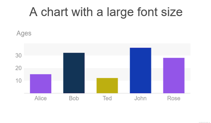
Chart configurations and options
We can adjust the configuration of Vizzu charts through the config object. the following are some of the items that can be configured according to our taste:
Title
We can add titles to our charts that tell the reader what type of information the chart displays:
barChart.animate({
  config: {
    channels: {
      x: { set: ["Names"] },
      y: { set: ["Ages"] },

      //title of chart added
      title: "A chart showing something useful",
    },
  },
});
To set the title of a chart, we use the title property of channels and pass in a value.
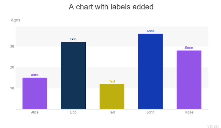
Labels
Data labels enable the reader to easily identify every piece of data present in a chart:
barChart.animate({
  config: {
    channels: {
      x: { set: ["Names"] },
      y: { set: ["Ages"] },
      label: { set: ["Names"] },
    },
    title: "A chart with labels added",
  },
});
To add labels to a chart, we use the label property. Here, we use the Names data as the label of the chart.
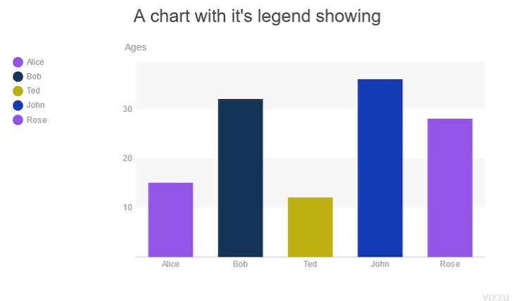
Legends
Legends are a small visual representation of a chart’s data. Like labels, legends help readers understand and interpret the chart’s data better.
barChart.animate({
  config: {
    channels: {
      x: { set: ["Names"] },
      y: { set: ["Ages"] },
      color: { set: ["Names"] },
    },
    title: "A chart with it's legend showing",
    legend: "color",
  },
});
We have to attach legends to one of the available channels for the legends to show.
In the code block above, we attach the legend to the color channel.
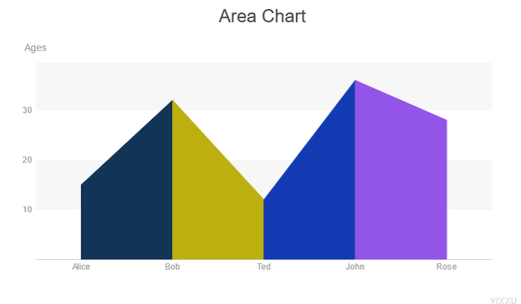
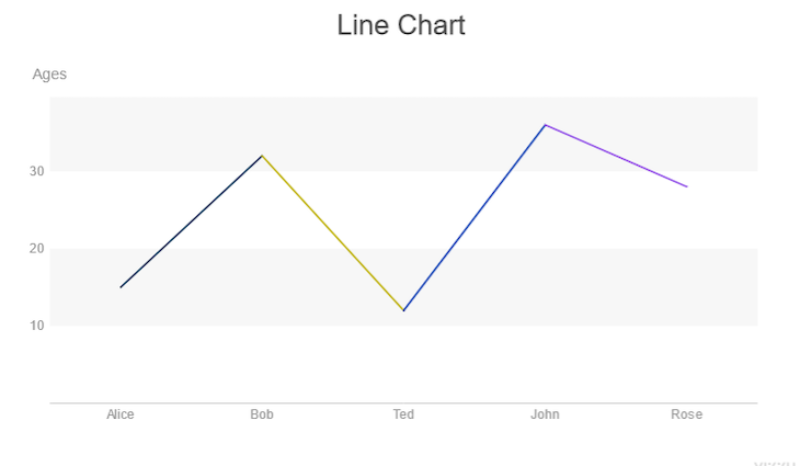
Geometry
Like we saw earlier, the geometry of a chart element is one of a Vizzu chart’s animatable properties. It is also one of the properties we can configure. There are 4 geometries in Vizzu:
area, line, circle, and rectangle.
Let’s see how to change the geometry of a chart:
chart.animate({
  config: {
    //we set the geometry we want for the chart here
    geometry: "rectangle","area", "line", "circle"
  },
});
To change the geometry of a chart we use the geometry property, and set it to the shape we want.
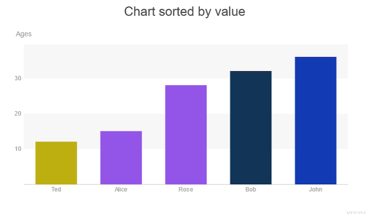
Sorting
Vizzu provides chart sorting options that allow us to arrange the order in which data is plotted on charts. By default, the plot data is sorted in the order it is added.
To sort the chart in ascending order, we set the sort property to byValue:
barChart.animate({
  config: {
    channels: {...},
    //sorts chart elements in ascending order
    sort: "byValue",
  },
});
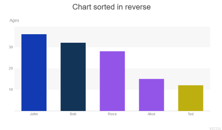
To sort the chart in descending order, we set the reverse property to true. When reverse is used without setting sort to byValue, the chart will be arranged in the opposite order of how the data was passed in:
barChart.animate({
  config: {
    channels: {...},
    //sorts chart elements in ascending order
    sort: "byValue",

    //changes to descending order
    reverse: true
  },
});
Alignment
There are different ways we can align chart elements. We can stretch them, center them, or stick with the default alignment.
Let’s see how to adjust the alignment of charts:
barChart.animate({
  config: {
    channels: {...},
    align:"center",
    align:"stretch",

    //the default alignment
    align:"none",
  },
});
We select the type of alignment we want and pass that value to the align property.
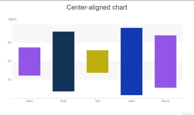
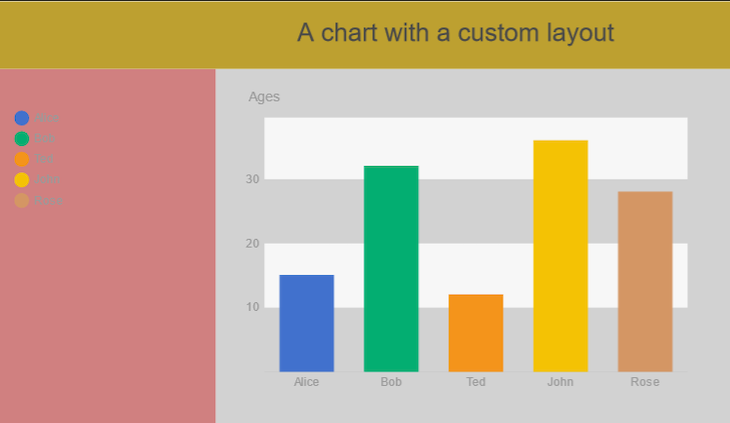
Chart layouts
There are three separate parts to a chart’s layout: the chart title on the top, the legend on the left, and the plot area that contains the chart.
We can customize the layout of a chart from the style object:
barChart.animate({
  config: {
    channels: {
      x: { set: ["Names"] },
      y: { set: ["Ages"] },
      color: { set: ["Names"] },
    },
    title: "A chart with a custom layout",
    legend: "color",
  },
  style: {
    title: {
      backgroundColor: "#bdA030",
      paddingTop: 20,
      paddingBottom: 20,
      paddingLeft: 200,
    },
    plot: { backgroundColor: "#D2D2D2" },
    legend: { backgroundColor: "#d08080", width: 350 },
  },
});
Here, we style the title, plot, and legend sections of the chart.
First, we change the background color of the plot.
Next, we change the background color of the legend and increase its width.
Finally, we increased the padding of the title and changed its background color.
Conclusion
How data is presented is as important as its collection; data is meaningless if it cannot be understood.


WMK Tech Copyright © 2024. All rights reserved

